Overview
Type of Project
Brand Identity Concept
My Role
Art Direction, Graphic Design
Tools
Illustrator
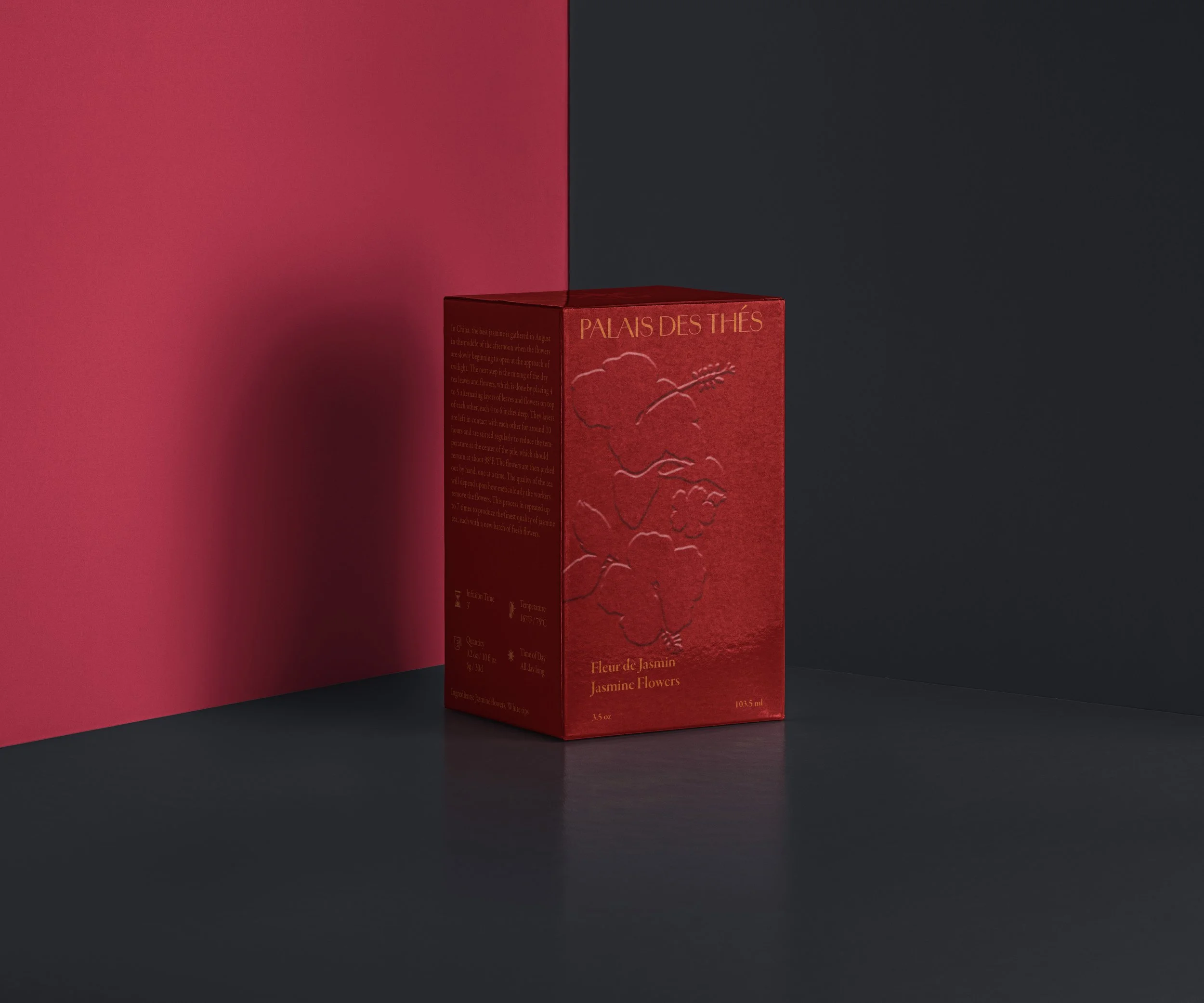
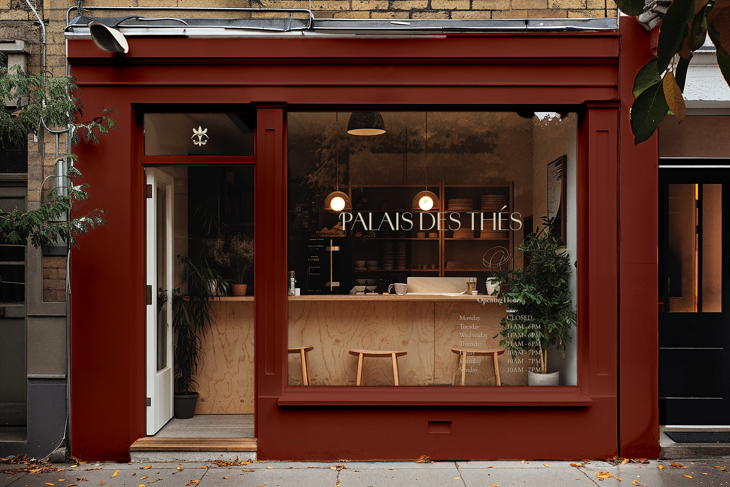
This project re-envisions Palais des Thés as a Parisian luxury tea house, steeped in elegance and sensory experience. The rebrand draws from the company’s mission, heritage, and deeply rooted appreciation for tea culture, translating them into a visual identity that feels both timeless and contemporary. By elevating the brand’s voice and aesthetics, the new system speaks to a discerning audience—one that values craftsmanship, ritual, and the quiet sophistication found in every cup.
Background
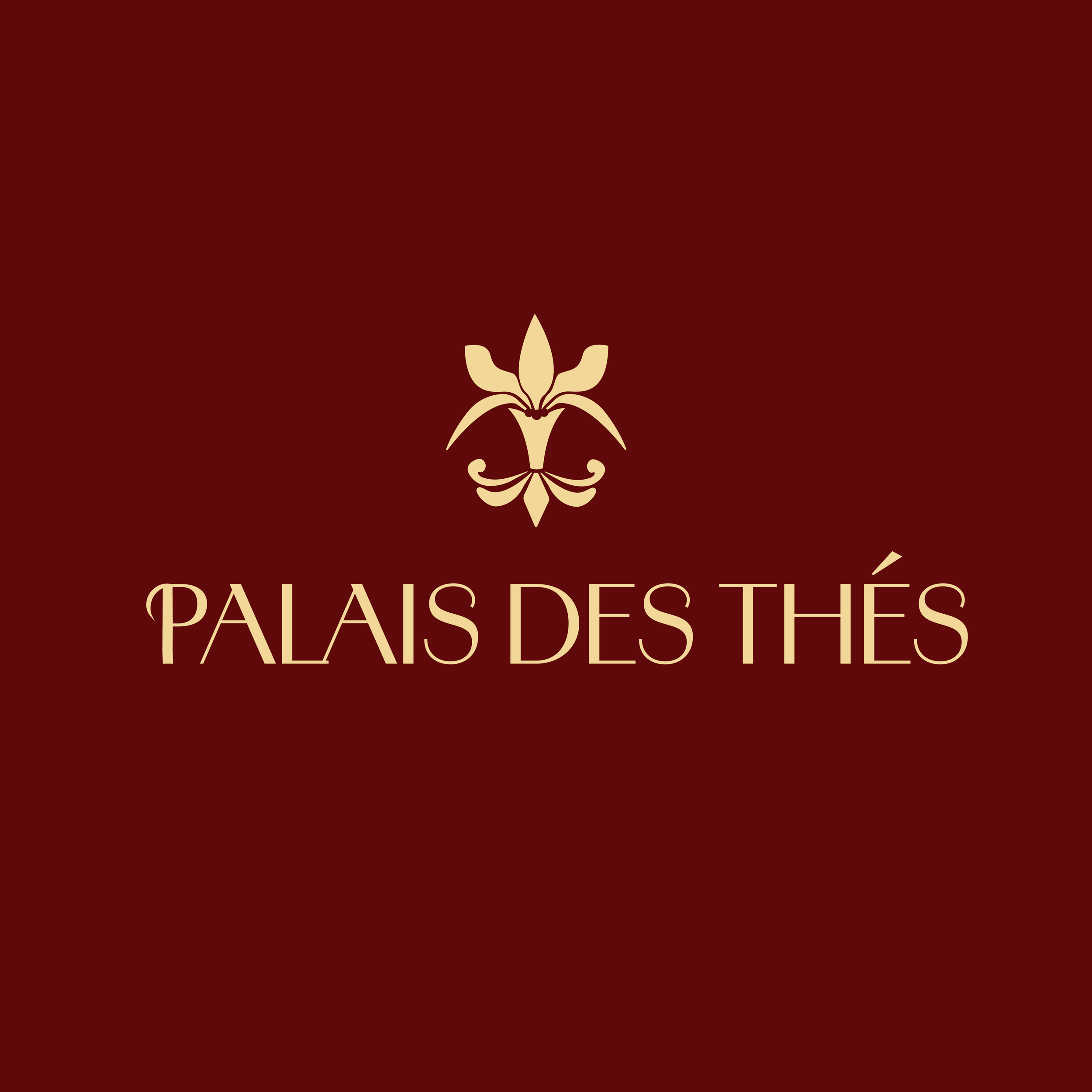
LOGOS

MOODBOARD
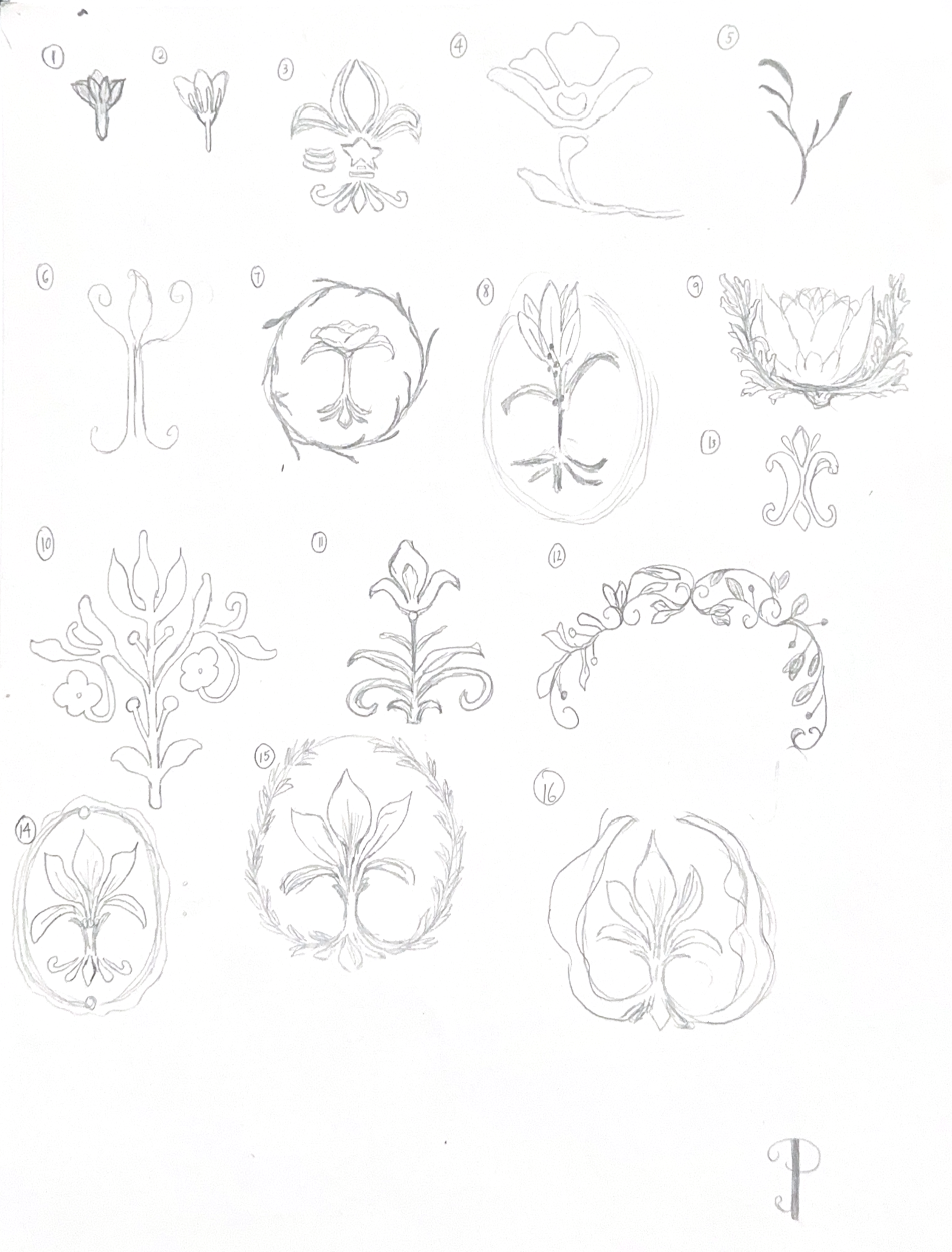
Building on the insights from my initial research, I discovered that the fleur-de-lis, a symbol historically associated with French royalty, is widely recognized and carries strong cultural significance. Visually, its shape also reminded me of a bundle of tea leaves—elegant, organic, and structured. This connection inspired the core concept for the logo: a stylized emblem that fuses the fleur-de-lis with the natural forms of tea leaves and berries, creating a mark that is both rooted in French heritage and reflective of the brand’s identity as a high-quality, contemporary tea house.
Creating the Logo
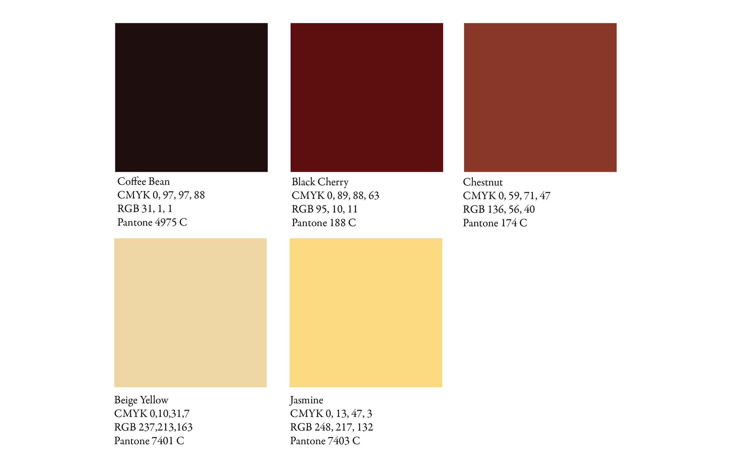
COLOR PALETTE
Creating the Color Palette
The color palette is inspired by different teas and the various stages of tea steeping.
TYPOGRAPHY
Choosing the Typography
The typgraphy chosen for this rebrand is Amadine for the primary typeface, with Garamond as a complimenting secondary typeface. Both give a luxurious, fancy vibe that is the feeling targeted for this rebrand. Amadine mixes thin and thick strokes, and adds curling details for specific letters that give it a delicate yet striking and impactful look. Meanwhile Garamond is a classic, readable serif font that evokes the luxurious look we are aiming for.