Overview
Type of Project
Independent Project
My Role
Art Direction, Graphic Design
Tools
Indesign
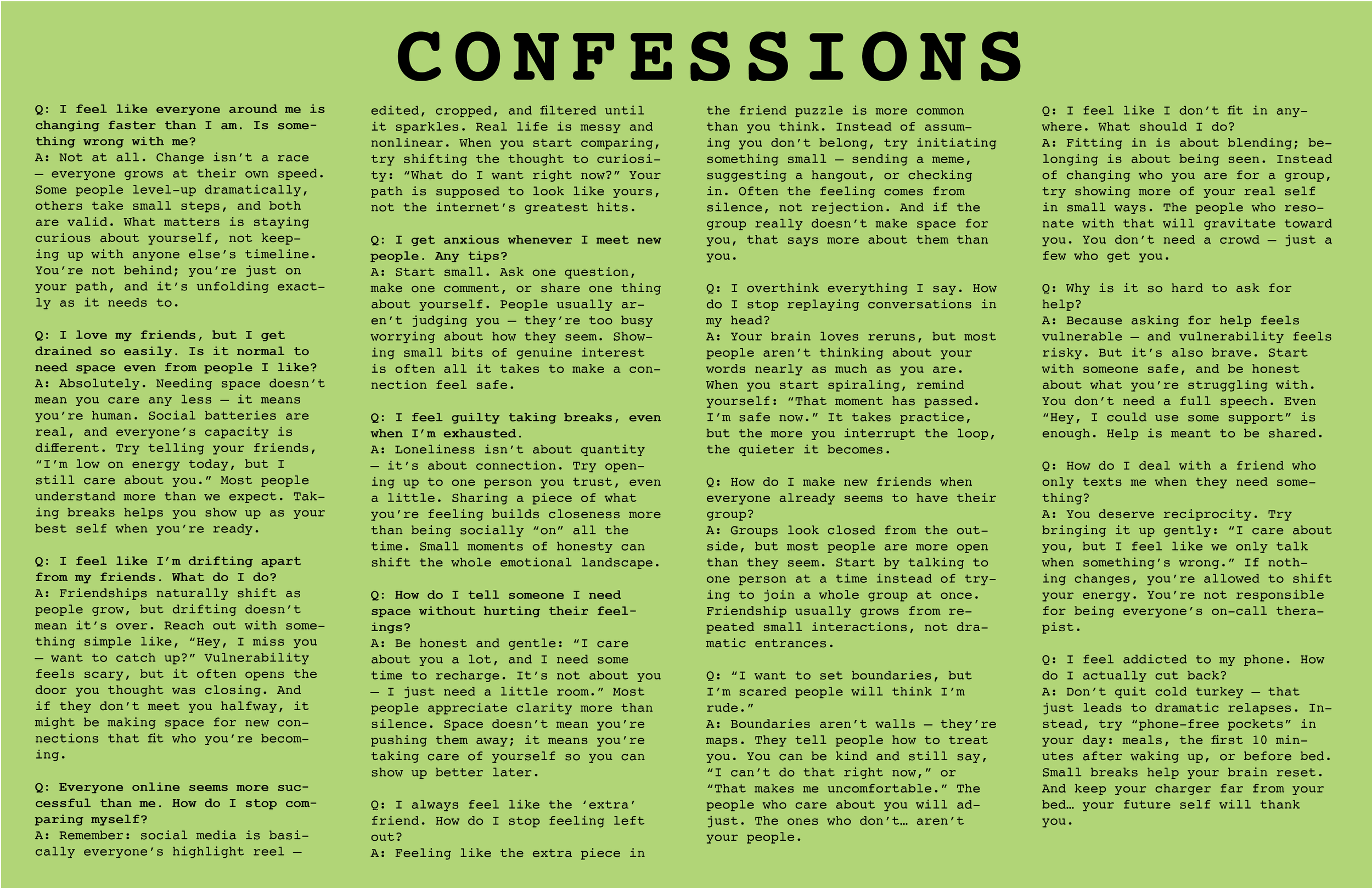
The challenge was to develop a cohesive visual system for a series of quarterly magazine issues, each exploring a different facet of mental health. Untold Stories is designed for a younger audience, offering a space where complex emotions and personal struggles can be approached with honesty, sensitivity, and clarity.
The project required creating a design language that could evolve across issues while still feeling unified—balancing expressive visuals with thoughtful structure. Through typography, color, illustration, and layout, the system supports the magazine’s mission: to open conversations, destigmatize mental health topics, and guide readers through reflective, supportive content.
Each issue becomes its own narrative experience, visually translating themes like anxiety, identity, resilience, and self-discovery into an engaging and empathetic form. The result is a publication that doesn’t just inform—but resonates, encourages connection, and makes space for stories that often go unheard.
Background
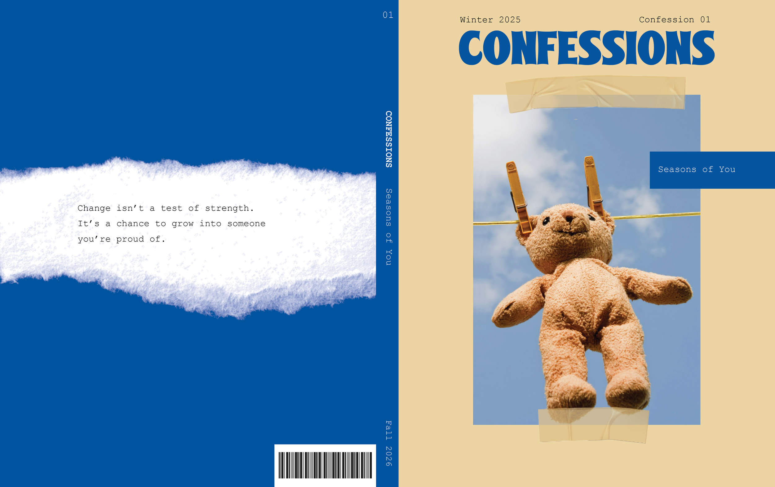
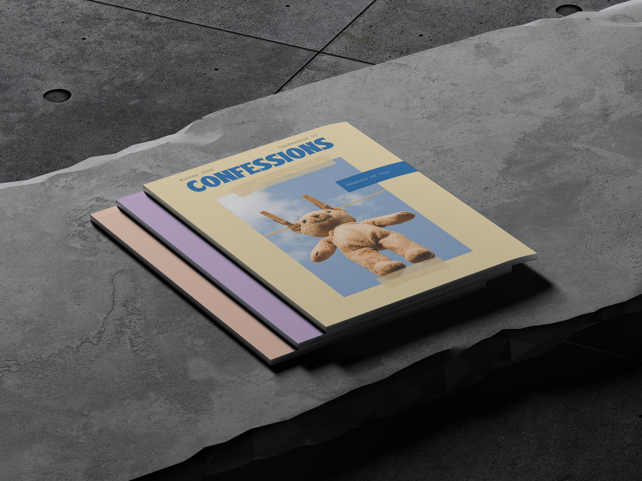
COVER
Because the magazine centers on mental health, I wanted the design to feel as intimate and personal as a journal—somewhere you’d jot down feelings, memories, and honest reflections. The visual style draws from journaling and scrapbooking, with a photo anchored at the center and layered with different adhesive textures.
On the back cover, a paper note shares the editor-in-chief’s key takeaways for the issue, reinforcing the idea of personal growth and reflection.
Creating the Cover

MASTHEAD
Creating the Masthead
At the top of the cover, the masthead spells out Confessions, instantly setting the tone for a magazine rooted in honesty and journal-like reflection. The date appears quietly on the upper left, while the issue number anchors the upper right. We label each issue “Confession #” framing it as a written entry pulled straight from someone’s private notebook.
SPINAL SYSTEM
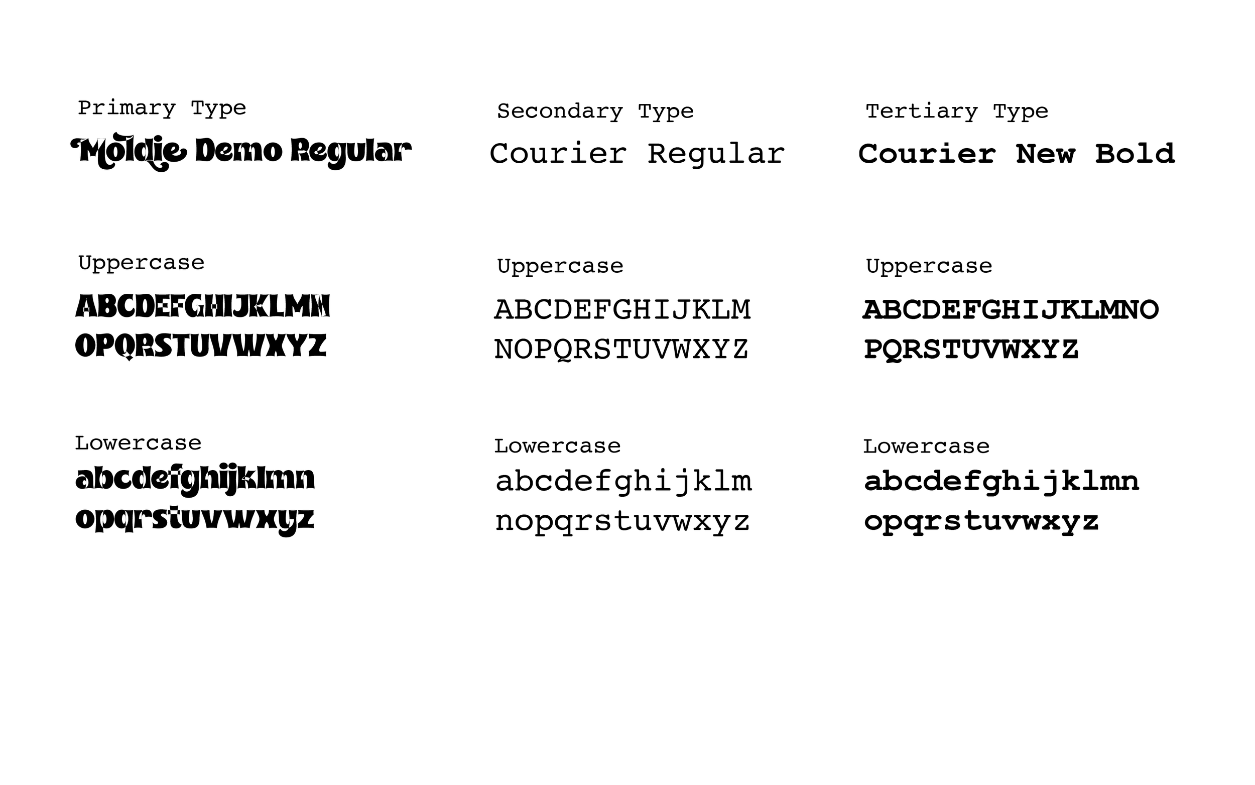
TYPOGRAPHY
Choosing the Type
For the title, we selected Moldie Demo Regular to bring a fun, youthful energy to the design. Since the magazine explores heavier mental health topics, we wanted the visuals to offer a sense of brightness and playfulness—something that resonates with a younger audience. For the body copy, we paired it with Courier Regular, evoking the nostalgic, typewriter feel of a handwritten journal entry.

COLOR PALETTE
Choosing the Color Palette
Brighter pastels and playful colors were chosen to counterbalance the heavier topics, giving the magazine a light, uplifting feel.